CSS3 Mobile Menu:What is a CSS3 mobile menu and why is it important for responsive web design?
Q: What is a CSS3 mobile menu and why is it important for responsive web design?
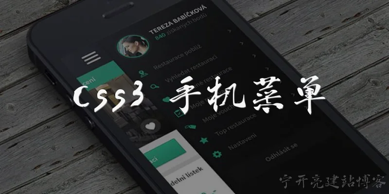
A: A CSS3 mobile menu is a navigation interface specifically designed for small screens using modern CSS features like media queries, flexbox, transitions, and transforms. It typically collapses the desktop navigation into a hamburger icon that expands into a full-screen or slide-out panel when thtml">apped. This pattern is important because mobile devices now account for over half of global web traffic, and traditional horizontal menus simply don't fit on narrow viewports. Without a dedicated mobile menu, users would face tiny tap targets, horizontal scrolling, and frustrating zooming. CSS3 makes it possible to build these menus without heavy JavaScript libraries—using :checked pseudo-classes, the checkbox hack, or minimal JS toggles alongside CSS transitions for smooth animation. Media queries let you swap layouts at specific breakpoints, ensuring desktop users see a full menu while mobile users get a compact icon. Accessibility matters too: proper ARIA attributes, focus management, and keyboard support should accompany any CSS3 mobile menu so screen reader and keyboard-only users can navigate comfortably. A well-built menu also improves perceived performance, since pure CSS animations are GPU-accelerated and lighter than JavaScript-driven equivalents.
Q: How do you create an animated slide-in mobile menu using only CSS3?
A: Creating a slide-in mobile menu with pure CSS3 relies on a hidden checkbox and the :checked pseudo-class to toggle state without JavaScript. Start with a label styled as a hamburger icon, and an invisible checkbox input placed before the navigation element in the HTML. Your nav menu is positioned fixed at the top-left or right, with a transform of translateX(-100%) to hide it off-screen, plus a transition property like transition: transform 0.3s ease-in-out. When the checkbox is checked, a sibling selector such as input:checked ~ nav html">applies transform: translateX(0) to slide the menu into view. Add a semi-transparent overlay using another pseudo-element or div that fades in with opacity and visibility transitions, and dim the page behind the menu. For the hamburger icon itself, you can animate the three lines into an X using rotate and opacity on individual spans. Remember to include a media query setting display: none for the toggle on larger screens and show the horizontal desktop menu instead. Also handle body scroll locking, though that often requires a tiny bit of JavaScript. Overall, a pure CSS3 slide menu keeps your project dependency-free, fast, and easy to maintain while still delivering a polished mobile experience.
Q: What are the best practices for making a CSS3 mobile menu accessible and user-friendly?
A: Accessible CSS3 mobile menus start with semantic HTML: use a <nav> element, an unordered list of links, and a real <button> for the toggle rather than a div. Include aria-expanded on the button, toggling it between true and false, and aria-controls pointing to the menu's ID. If you use the checkbox hack, keep a visually hidden but focusable input, and label it clearly. Tap targets should be at least 44 by 44 pixels to meet WCAG guidelines, with generous spacing between links. Color contrast between text and background must reach a 4.5:1 ratio for normal text. Ensure the menu is fully keyboard navigable: Tab moves through links, Escape closes the panel, and focus is trhtml">apped inside when the menu is open—returning to the toggle button on close. Animate with transform and opacity only, avoiding layout-shifting properties like width or top, so performance stays smooth on low-end phones. Respect the prefers-reduced-motion media query by disabling or shortening animations for users who opt out. Finally, test on real devices and with screen readers like VoiceOver and NVDA, because a menu that looks perfect visually can still be unusable for assistive technology users if these details are ignored.
Words of experience
Common scenarios of "CSS3 Mobile Menu"
【Web Developer】 Hey, I'm working on a mobile menu for a responsive site. I want to use CSS3 to make it smooth and modern. Any tips?
【UI Designer】 Absolutely! For mobile menus, CSS3 transitions and transforms are key. You can use a hamburger icon that toggles a slide-in menu from the side. Have you thought about the animation?
【Web Developer】 I was thinking of a slide-in from the left. But I'm not sure how to trigger it without JavaScript. Can I do it with pure CSS3?
【UI Designer】 Yes, you can use the checkbox hack! A hidden checkbox and a label styled as a hamburger icon. When checked, you can use the :checked pseudo-class to change the menu's transform.
【Web Developer】 That sounds clever. So the menu would be positioned off-screen initially, and then when the checkbox is checked, we translate it into view?
【UI Designer】 Exactly. Use transform: translateX(-100%) for the initial state, and then transform: translateX(0) when checked. Add a transition on transform for smoothness.
【Web Developer】 Got it. But what about accessibility? Screen readers might not handle the checkbox hack well.
【UI Designer】 Good point. For better accessibility, you should add ARIA attributes and maybe use a button with JavaScript. But if you're going pure CSS, you can still add aria-hidden and manage focus.
【Web Developer】 I see. Maybe I'll use a button with a small JavaScript snippet for toggling a class. That seems more robust.
【UI Designer】 That's often the best approach. You can still use CSS3 for the animations. Just toggle a class like .open on the menu, and define the transition in CSS.
【Web Developer】 Okay, so I'll have a button with aria-expanded, and when clicked, it toggles the class. Then in CSS, I'll have .menu { transform: translateX(-100%); transition: transform 0.3s ease; } and .menu.open { transform: translateX(0); }
【UI Designer】 Perfect. Also consider adding a backdrop that fades in when the menu is open. You can use a pseudo-element or a separate div with opacity transition.
【Web Developer】 Nice touch. I'll add a backdrop with background-color: rgba(0,0,0,0.5) and transition opacity. But how do I handle closing the menu when clicking the backdrop?
【UI Designer】 You can add a click event on the backdrop that removes the .open class. Or if you're using pure CSS, you can use the checkbox hack and label the backdrop as another label for the checkbox to uncheck it.
【Web Developer】 I think I'll go with JavaScript for the click handling. It's more straightforward. Also, I want the menu to be swipeable on touch devices. Any CSS3 support for that?
【UI Designer】 CSS3 doesn't have touch gestures, but you can use touch events in JavaScript to detect swipes. Then apply the same class toggle. For the animation, you can use CSS transitions or even CSS animations with keyframes.
【Web Developer】 Alright. I'll implement a simple swipe detection. Also, I want the menu items to have a staggered animation when the menu opens. Can I do that with CSS3?
【UI Designer】 Yes, you can use transition-delay on each menu item. For example, .menu.open .item:nth-child(1) { transition-delay: 0.1s; } and so on. That creates a nice cascade effect.
【Web Developer】 That's a great idea. I'll also add some hover effects for desktop, but ensure they don't interfere on mobile. Maybe use media queries to apply hover only on devices that support it.
【UI Designer】 Exactly. Use @media (hover: hover) to apply hover styles. That way, touch devices won't have sticky hover states. And don't forget to test on various devices and browsers.