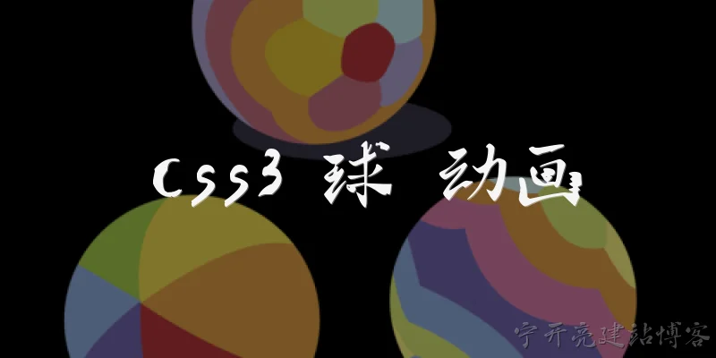
CSS3 ball animation:How do you create a simple bouncing ball animation using CSS3?
Q: How do you create a simple bouncing ball animation using CSS3?
A: To create a bouncing ball with CSS3, define a div with a fixed width and height, give it a border-radius of 50% to make it circular, and add a background color or gradient. Then use @keyframes to animate translateY from 0 to a negative value and back, simulating a bounce. Apply the animation property with a duration, infinite iteration, and ease-in-out timing. For realism, adjust the keyframe steps to mimic gravity and squash-stretch. This requires no JavaScript and runs smoothly on modern browsers.
Q: What CSS3 properties are essential for animating a ball's movement?
A: The essential CSS3 properties for ball animation are transform (for translate, rotate, scale) and animation (to link keyframes). Use @keyframes to define percentage-based steps. For a bouncing ball, transform: translateY() controls vertical motion. Add animation-timing-function like cubic-bezier for natural easing. Also, border-radius: 50% shapes the ball. For 3D effects, use perspective and transform-style: preserve-3d. Opacity and box-shadow can add realism during motion, but the core relies on transform and animation for smooth, GPU-accelerated performance.
Q: How can you make a CSS3 ball animation html">appear more realistic?
A: To increase realism, incorporate easing functions like cubic-bezier(0.3, 0.7, 1, 0.5) to simulate gravity. Add squash-and-stretch by scaling the ball on impact using transform: scaleY(0.8) scaleX(1.2) at the bottom of the bounce. Use a gradient background with radial-gradient to give a 3D spherical look. Include a shadow beneath the ball that scales with the bounce. Slight rotation while moving also helps. Finally, use animation-fill-mode and multiple keyframes to fine-tune timing and trajectory.
Q: Can you provide a basic CSS3 keyframes example for a ball drop?
A: Yes, here is a basic keyframes example: @keyframes drop { 0% { transform: translateY(0); } 50% { transform: translateY(200px); } 100% { transform: translateY(0); } }. Apply to a ball: .ball { width: 50px; height: 50px; border-radius: 50%; background: red; animation: drop 1s infinite; }. This creates a simple up-and-down motion. For a bounce effect, add intermediate steps with different heights, like 60% { transform: translateY(150px); } to simulate decreasing bounce height over time.
Q: What are common pitfalls when creating CSS3 ball animations?
A: Common pitfalls include using top/left instead of transform, which triggers layout reflow and jank. Another is forgetting to set animation-fill-mode, causing jumps. Overly complex keyframes can lead to performance issues. Not using will-change or hardware acceleration may cause stuttering. Also, failing to test on different browsers—some properties like cubic-bezier have varying support. Finally, ignoring accessibility: animations should respect prefers-reduced-motion. Always use transform and opacity for smooth 60fps animations, and keep keyframes minimal for maintainability.
Dialogue about
Common scenarios of "CSS3 ball animation"
【Alex】 Hey Jamie, I'm working on a CSS3 animation for a bouncing ball. Any tips on getting started?
【Jamie】 Sure! Start with a simple div and use @keyframes to define the bounce. You'll need to animate the transform property, specifically translateY.
【Alex】 Got it. So something like @keyframes bounce { 0%, 100% { transform: translateY(0); } 50% { transform: translateY(-100px); } }?
【Jamie】 Exactly! Then apply it to the ball with animation: bounce 1s infinite; But that will look linear. You should add easing to make it more realistic.
【Alex】 How do I add easing? I know about ease-in-out, but for a bounce, we need something like a gravity effect.
【Jamie】 You can use cubic-bezier. For a bounce, try cubic-bezier(0.5, 0.05, 1, 0.5) or use multiple keyframes to simulate acceleration and deceleration.
【Alex】 Multiple keyframes? Like adding intermediate steps?
【Jamie】 Yes, for example: 0% down, 25% up with ease-out, 50% down with ease-in, etc. But a simpler way is to use animation-direction: alternate; and set two keyframes.
【Alex】 I see. So if I use alternate, the ball goes up and down smoothly? But it still doesn't have the squash and stretch effect.
【Jamie】 Right, for squash and stretch, you can animate scaleX and scaleY at the bottom. For example, at 0% scale(1,1), at 50% scale(1.2, 0.8) when it hits the ground, then back.
【Alex】 That sounds cool. But how do I combine translateY and scale in the same keyframes?
【Jamie】 Just include both in the transform property: transform: translateY(0) scale(1,1); and so on. The order matters: translate then scale.
【Alex】 Okay, I'll try that. Should I use a separate element for the shadow?
【Jamie】 Yes, a shadow ellipse that scales and fades as the ball moves. Animate its opacity and scale to match the ball's height.
【Alex】 That makes sense. Any performance considerations?
【Jamie】 Use transform and opacity for animations, as they are GPU-accelerated. Avoid animating properties like top or left.
【Alex】 Good to know. I'll also add will-change: transform to the ball for smoother animation.
【Jamie】 That can help, but use it sparingly. Also, consider using CSS variables for easy tweaking of duration and height.
【Alex】 Great idea! I'll define --bounce-height and --bounce-duration. Then use them in the keyframes with calc().
【Jamie】 Perfect. And don't forget to test in different browsers. Some older browsers might need prefixes, but modern ones are fine.